


“Love this! Thankyou.” Sarah Jay Hawley
15+ Years Of Original Hand-Drawn Art, UI Design & Web
Artist & Graphic Designer for Loud N Clear Productions
- Poster design (painted by hand in Clip Studio Paint)
- Flyer design (painted by hand in Clip Studio Paint)
- Concept art
- Document design & layout
- Creative realisation & direction
- Illustration
- Web design & coding
- General creative support
Want to work with me? Say “hello!” through the Contact page or keep reading the details below.

Literacy Is Vital
I love reading and I think it’s one of the most important skills a person can develop. I write in my spare time – I find I can’t write if I’m not reading, for some reason – and the combination of learning new language and practising empathy is one of the best and most powerful things I ever introduced into my life. More words mean more thoughts and more empathy means more complexity to go with them.
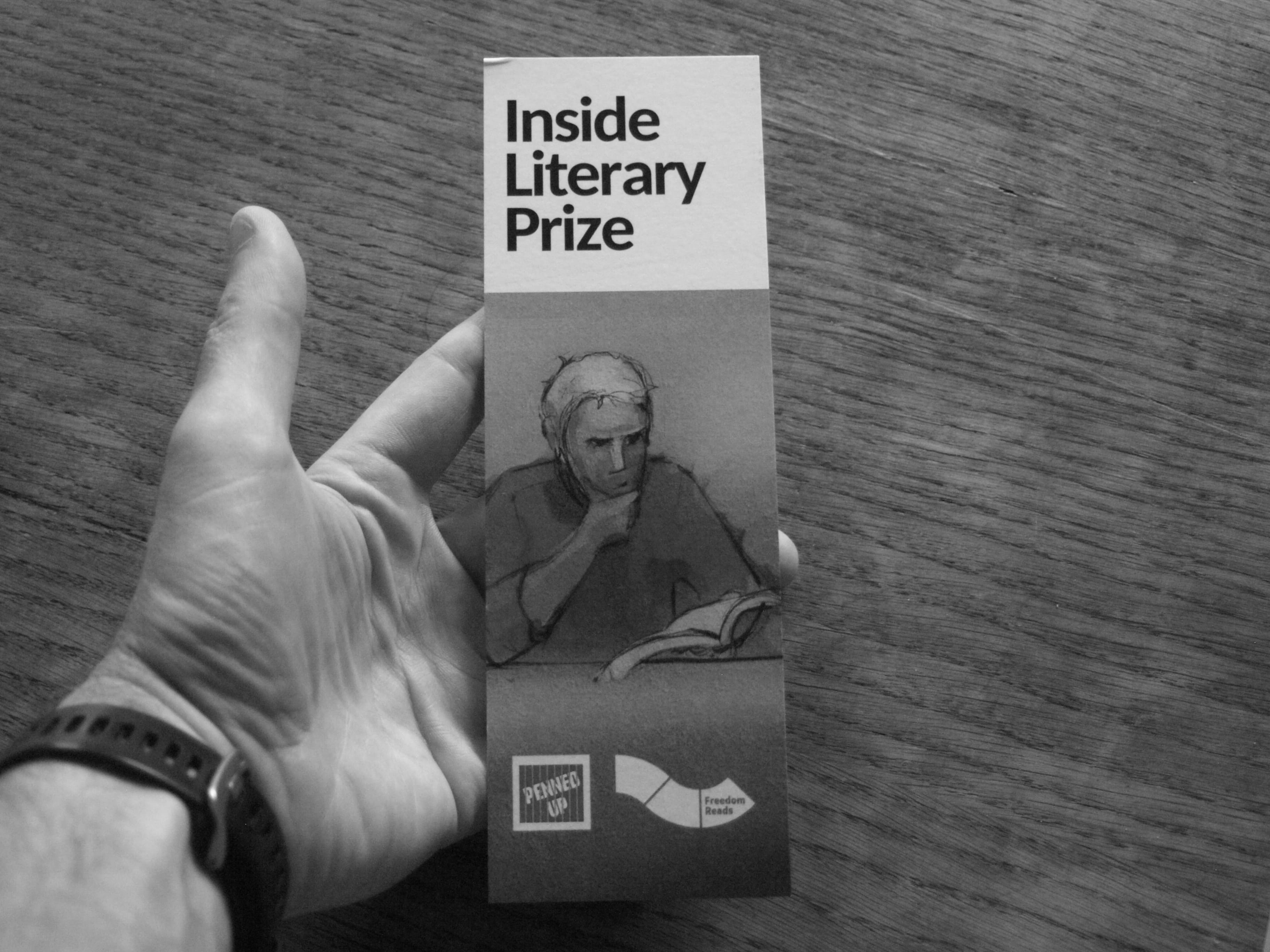
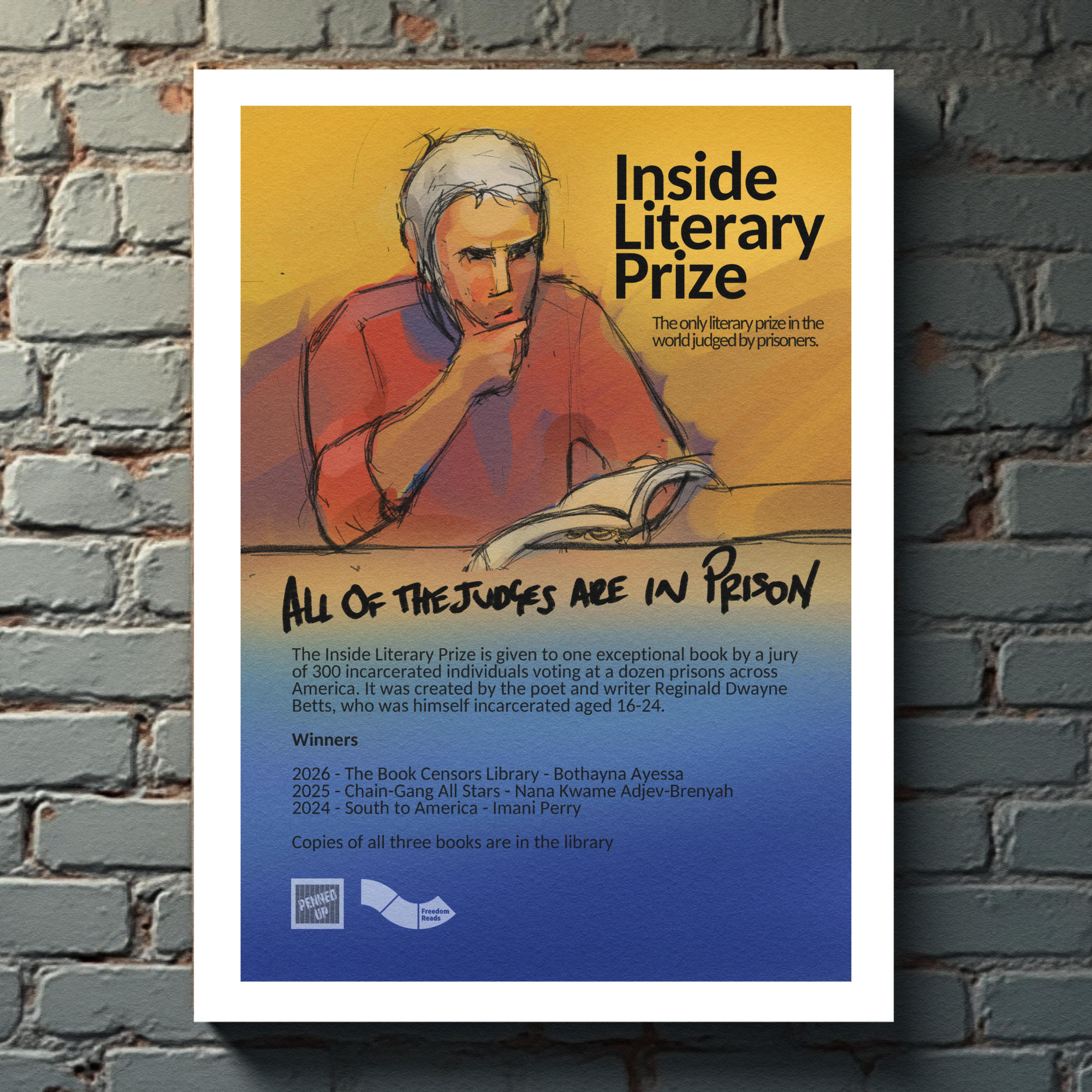
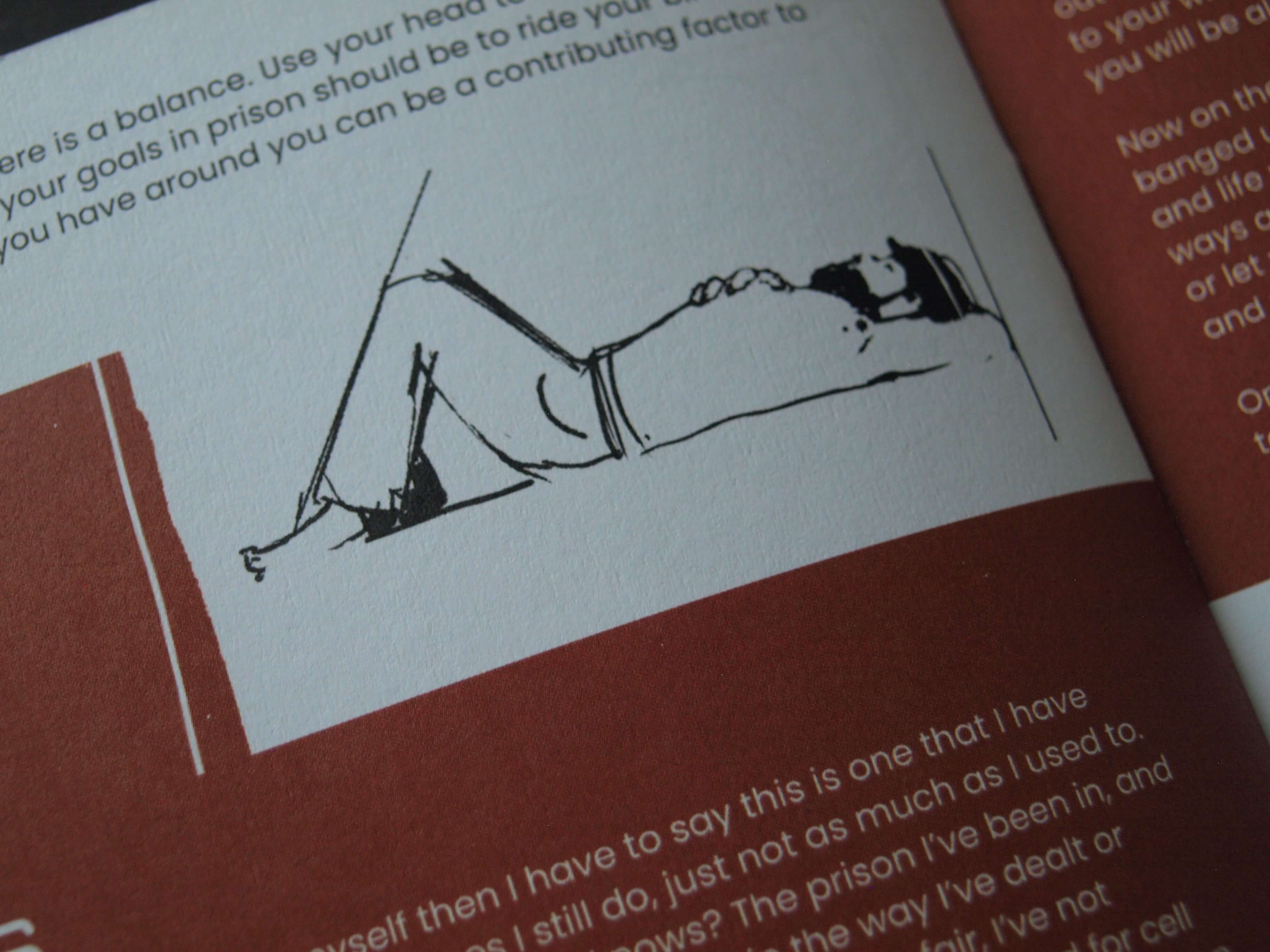
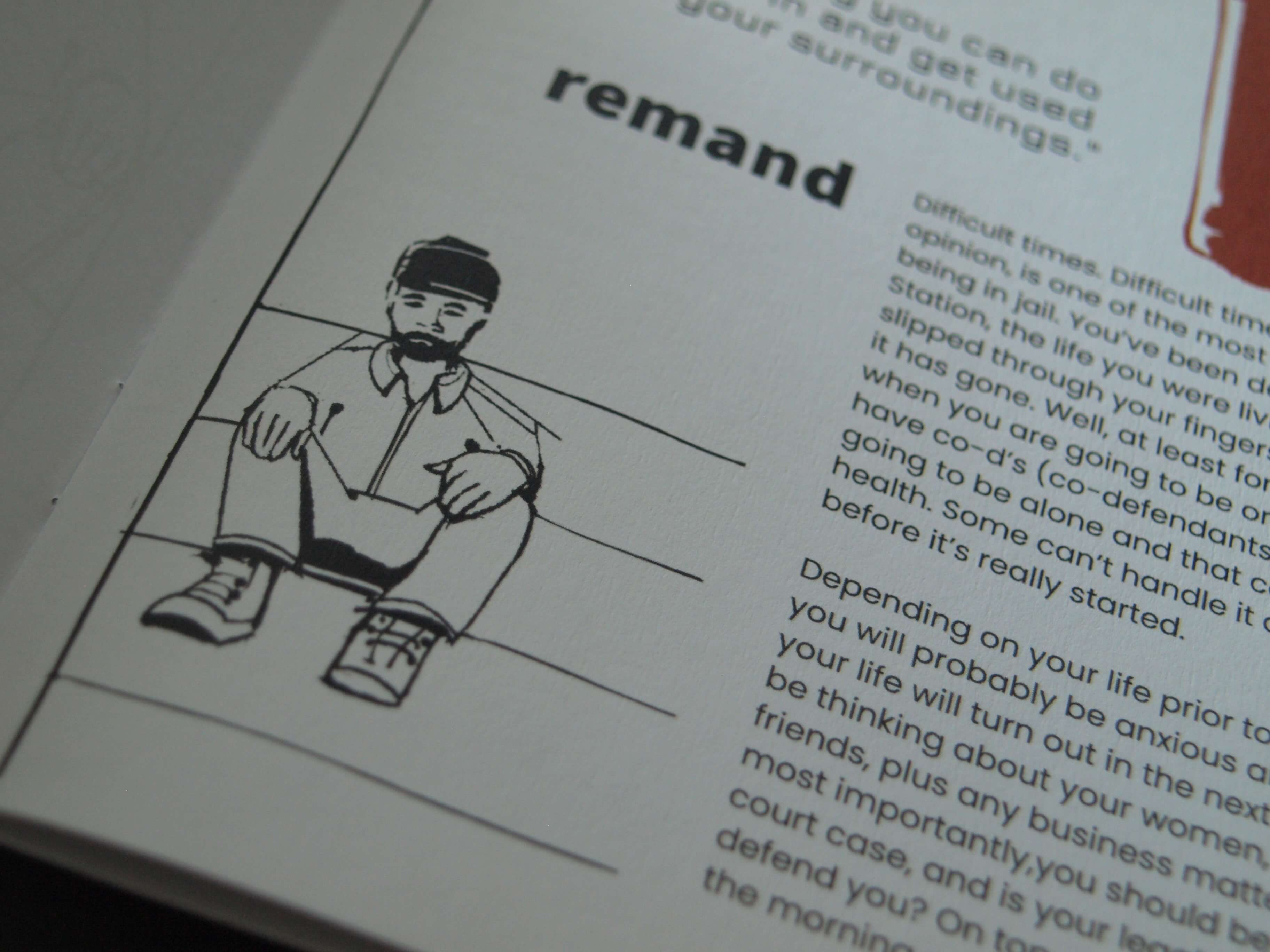
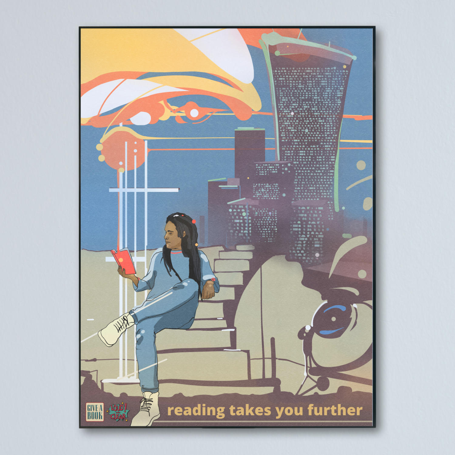
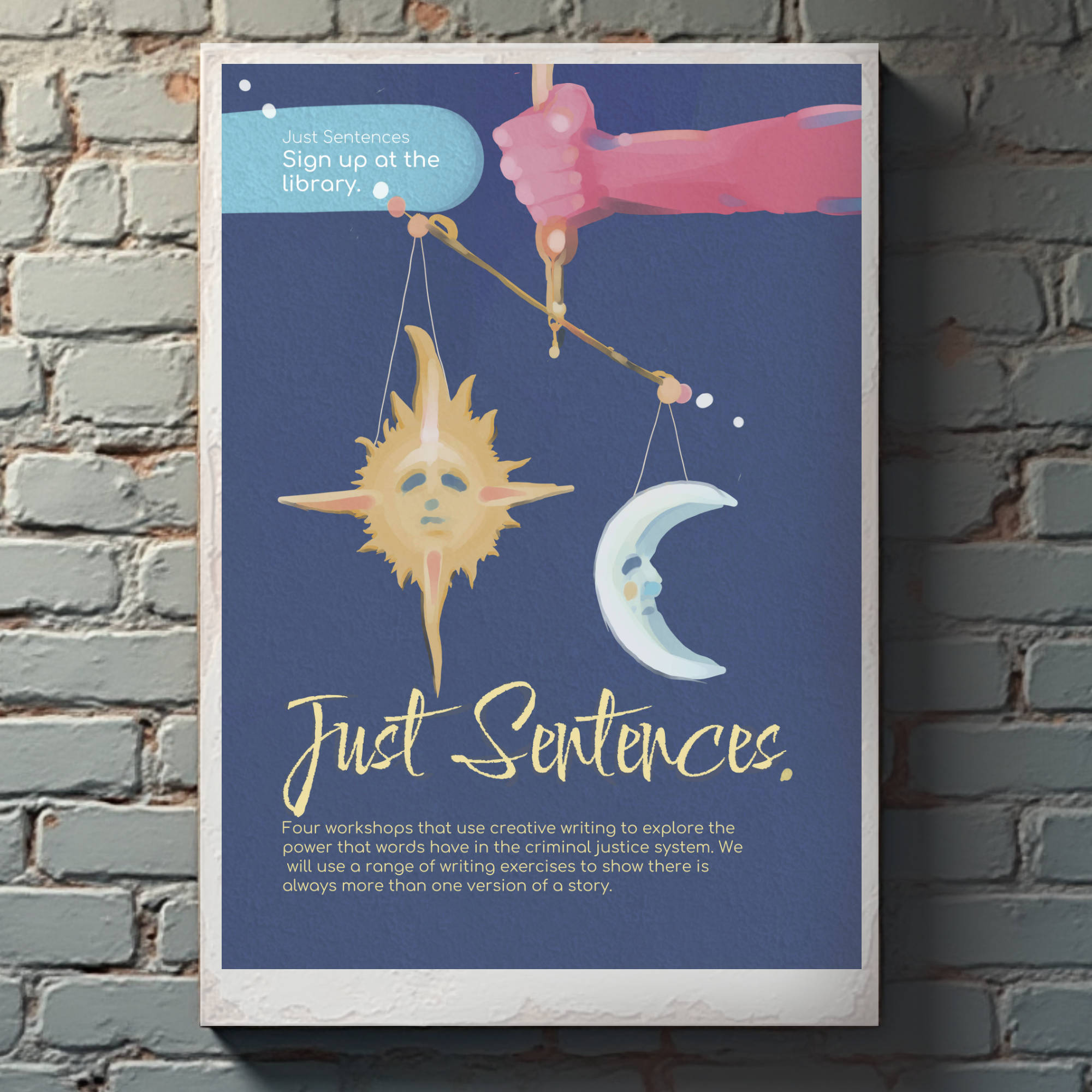
Award-winning creative director David Kendall runs literacy projects in some of Serco’s prisons, usually through his Loud & Clear organisation, but not always. He asked me to produce some art in support of his work some time ago and I’ve been doing it again and again ever since. I’ve made flyers, posters, reading games, web pages, art projects and more, with a view to helping people in prison rehabilitate and avoid re-offending, through the influence of self-expression, reading and art.
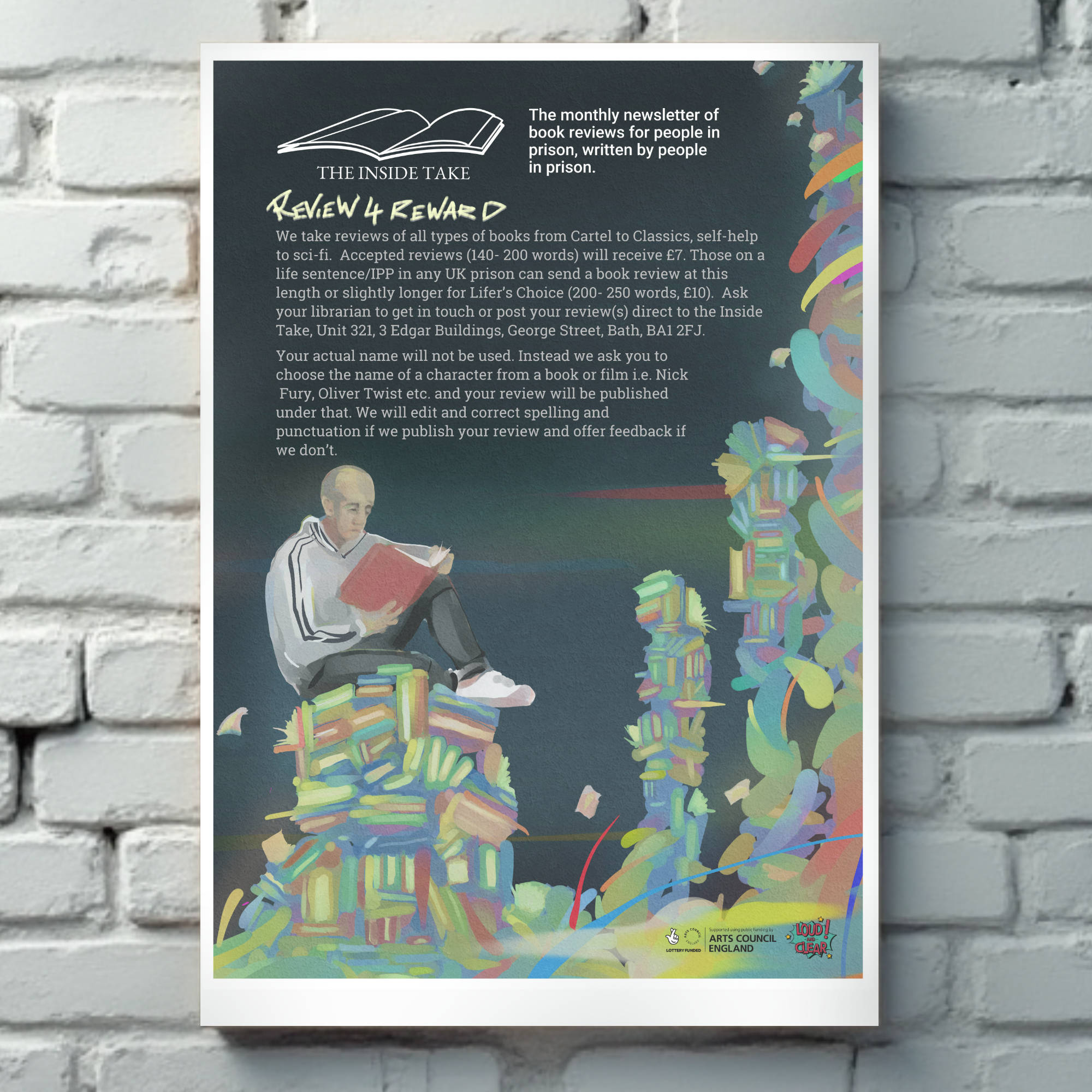
One of the most interesting projects we’ve worked on is The Inside Take, which is a regular newsletter for people in prison who like to read and talk about it. There are many prisons involved and the people there publish their book reviews under pseudonyms so they can’t be identified and then published document is distributed throughout the participating prisons. At the time of writing, it’s been going for over 23 issues and more and more people are contributing.
I designed the logo – an opening book – and I get sent the reviews as text, which I lay out on an A4 sheet (we use an A4 sheet because it needs to be photocopied for distribution; resources in prison are thin, for obvious reasons) which means that the design needs to work with minimal elements, which I love doing. I like to read myself, so it was a good challenge to make a lo fi document that prisoners would like to read – and be able to read – and that could still look good as a photocopy.
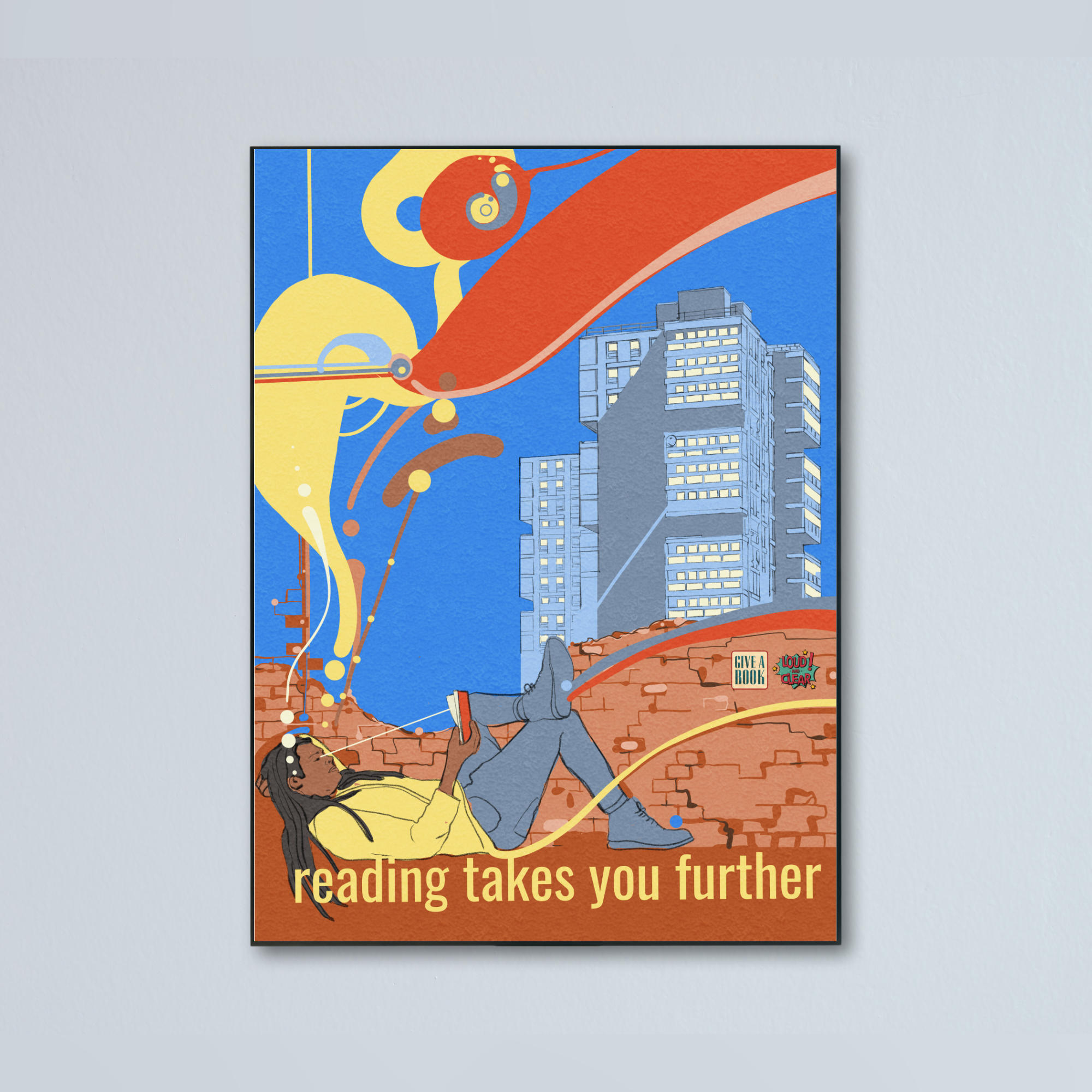
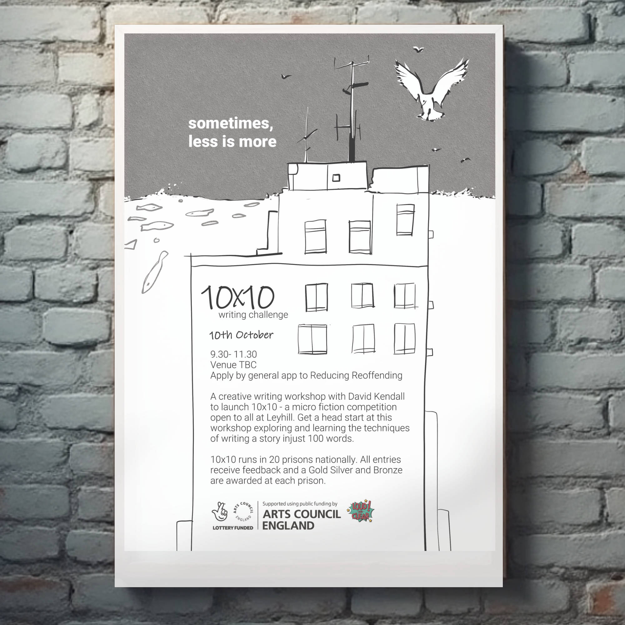
I did some big A2 colour posters too – several in fact, every year – and they’re always a pleasure too. I get to practise painting and drawing the human form (and plants and animals and buildings and more) and I get to think of ways to make text and writing appealing to men and women who are on remand, serving lengthy sentences and some are in prison for life.